Client Say No Morrison
I’ve been sitting on this project for a minute now. With the new year upon us, and my resolution to do my best to use this space to show you more, more, more…it’s reveal day! You have no doubt seen some of these pics posted on my Instagram, but let’s run through the juicy bits and details I don’t always dive into on the ‘gram. Say hello to #ClientSayNoMorrison!!!
So here is a bit of backstory for you. This family of four bought the house as a full gut remodel project. They had decided it was time to say goodbye to their decidedly traditional home, and hello to a bright and fresh start in a more open and modern house. They craved a “California Laid Back” vibe that felt more aligned with their own laidback lifestyle, and a place their tweenage girls could be proud to call home. So, we waltzed in and made quite a few changes to the layout, added windows, picked all the interior finishes, chose lighting locations, drew bathroom cabinetry details, selected hardwood floors, paint, tile…you name it! In my opinion, the coolest thing about this project was that it started as one thing, and over the course of working together, the clients learned to trust the process and be flexible to alternative creative ideas. By veering a bit off course from the scope we had originally planned on doing with them, the project blossomed into the best version of the home. It was a project filled with fun, and clients who really fell into the process of being open to doing what was best for the house, and them! In the end, we did our damndest to transform this project into a home that checked all the homeowner’s boxes!
Living Room
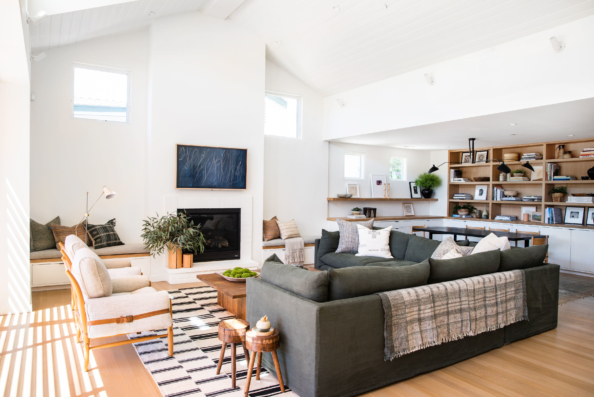
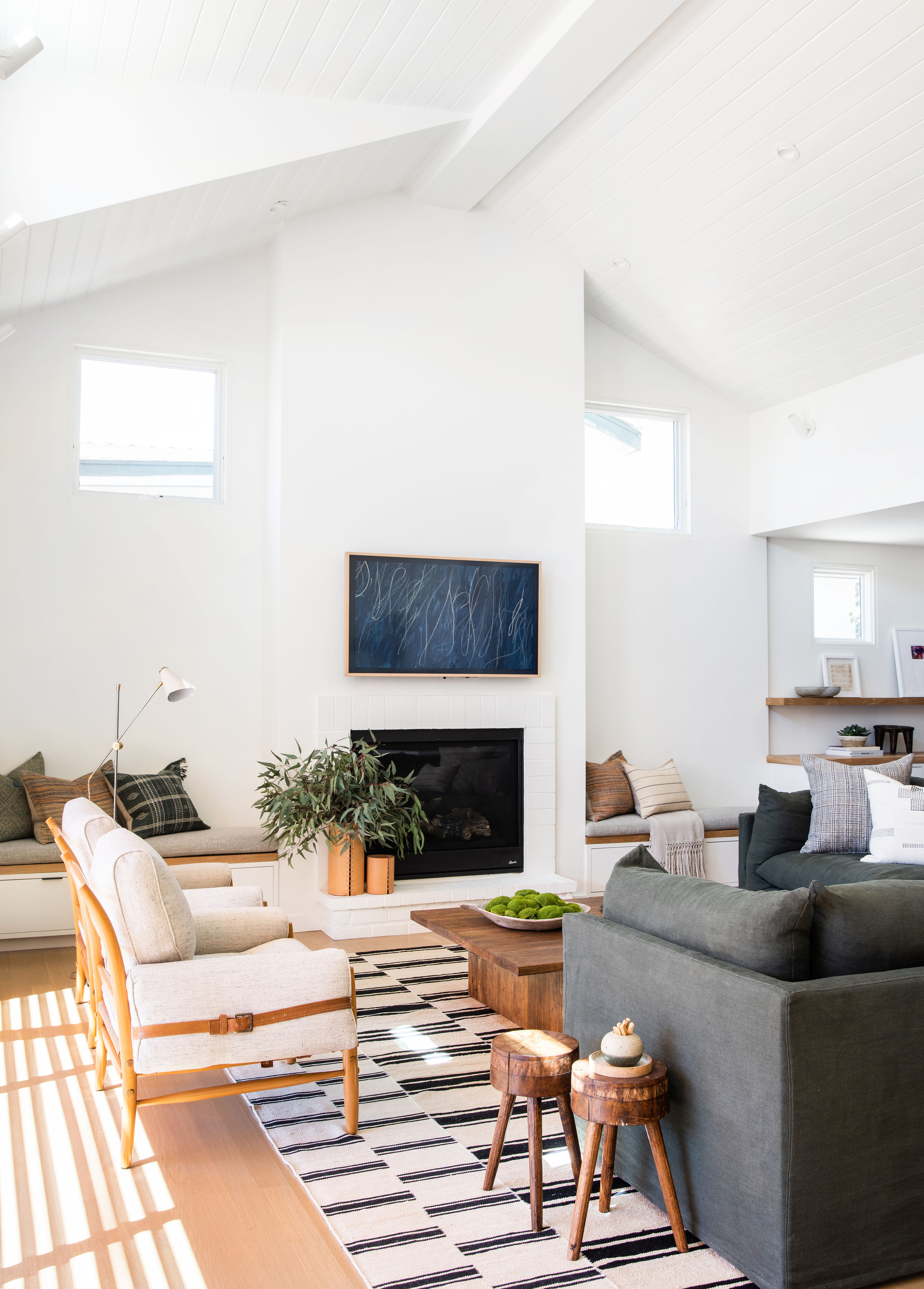
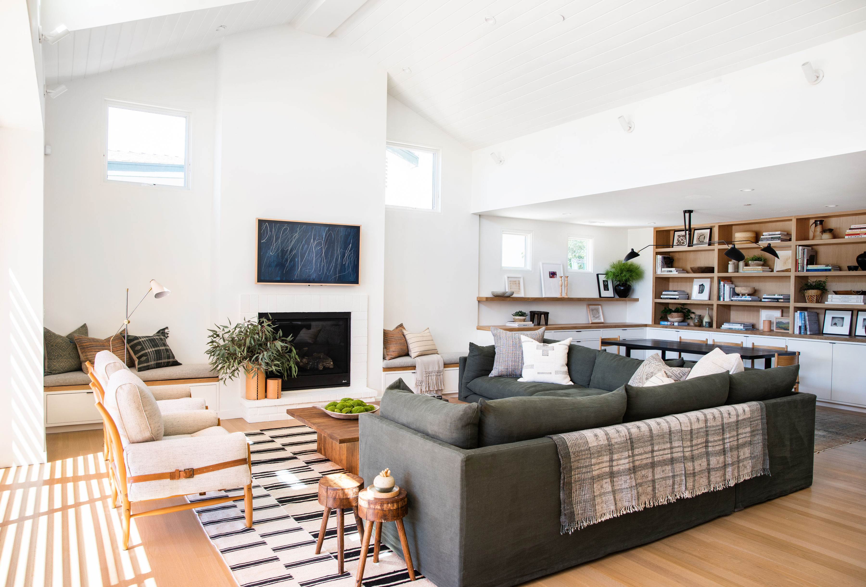
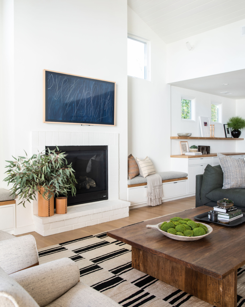
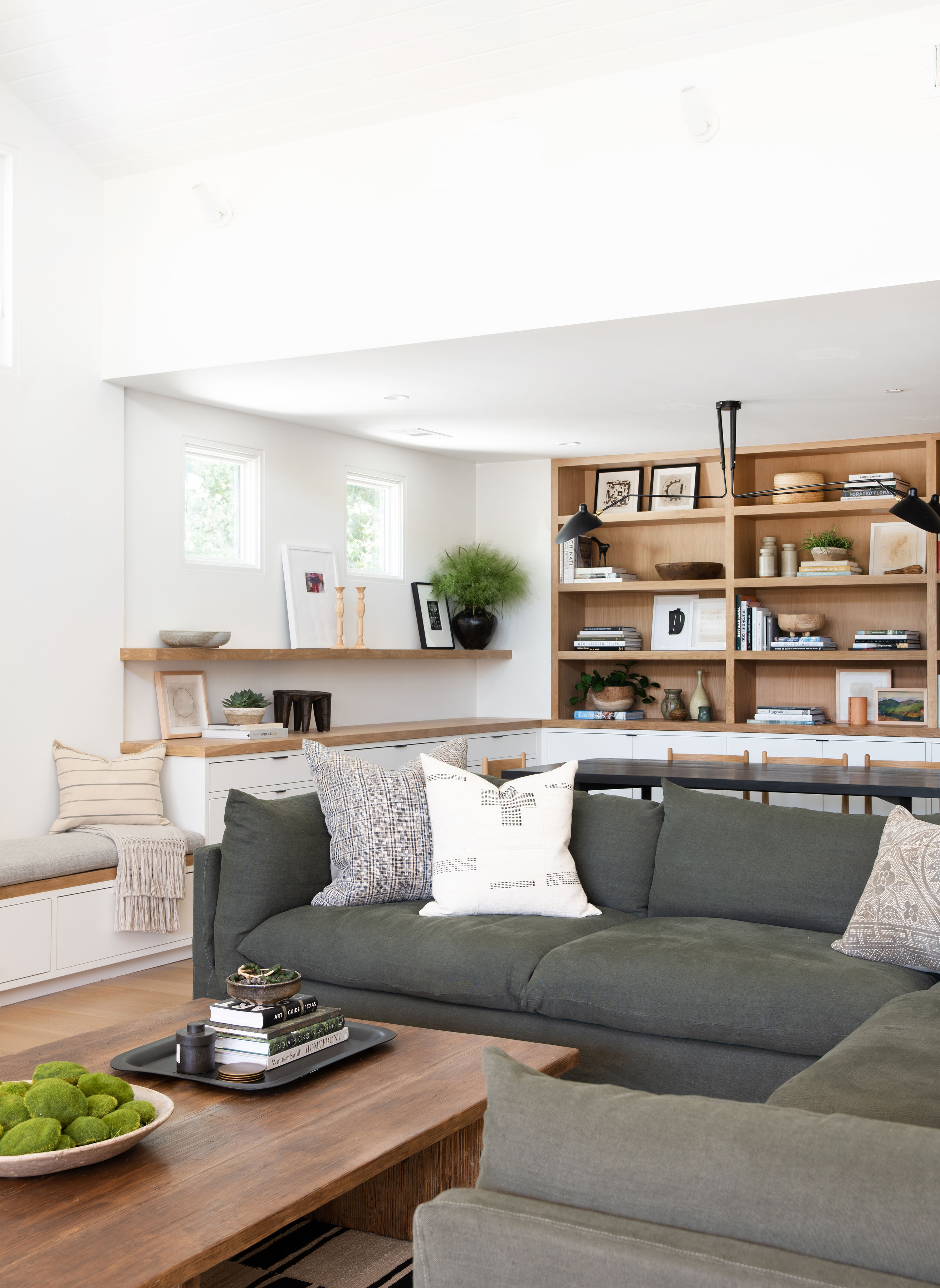
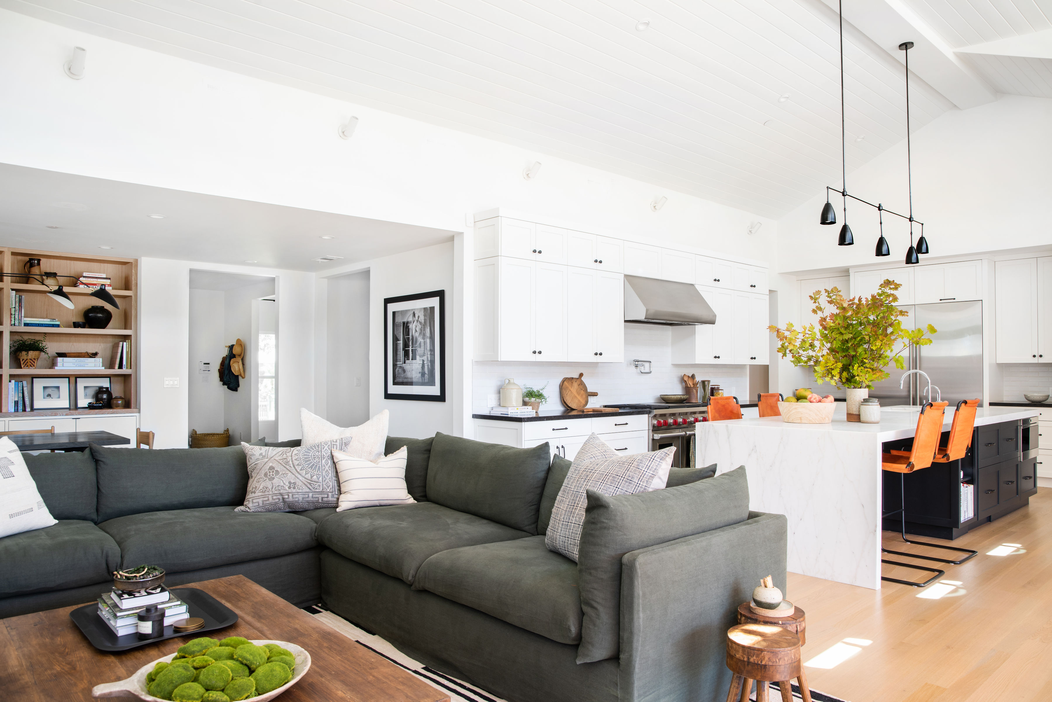
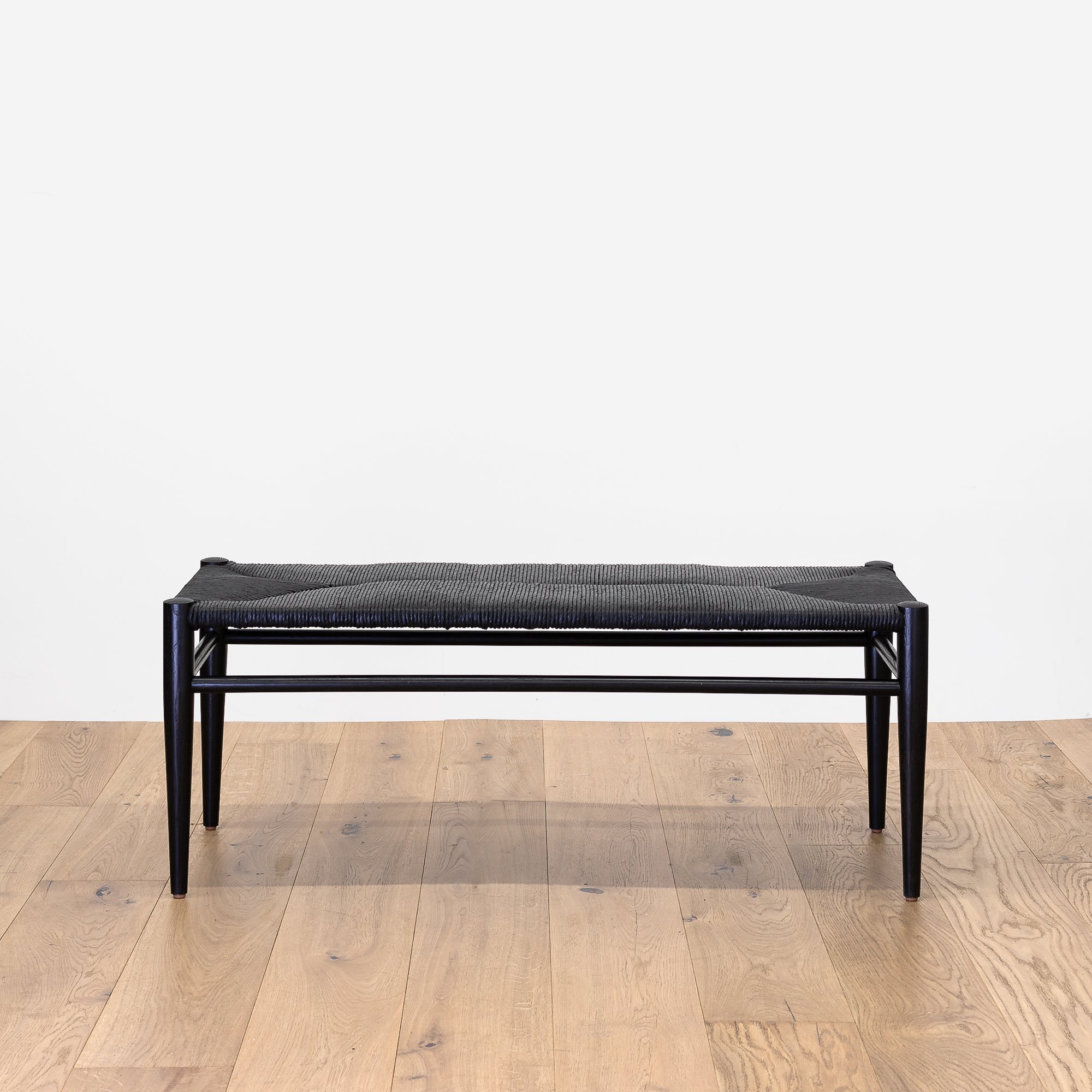
We knew this room would be the main gathering place for the whole family. When we came in, we decided to rework the layout, creating an open concept and taking advantage of the stunning tall ceilings and grandness of the room. First things first. We decided to paint the entire house “White Dove” by Benjamin Moore. This house was filled with natural light and “White Dove” has just the right amount of warmth to it, so it softens the brightness and starkness. That being said, the clients wanted pops of black and white elements throughout the room, so we needed a way to ground the space by adding warmth in color and tones with the furniture and textiles. For example, the client wanted something graphic, so we landed on this black and white rug which felt like a good mix of modern and slightly vintage kilim inspired. (PS. If you’re asking for this rug, we actually had it custom made with two vintage kilims sewn together, but have other options over at Shoppe.) Then, we added in a custom Montana Sectional in a beautiful dark forrest green fabric from Shoppe. To balance the space, we wanted to have a grounding and perfectly contrasting tone of green to help anchor the room and create a departure from all the white. As you can see, this room connects to the Dining Nook with white oak shelving, so we tied in white oak into the benches to create flow. Last, but certainly not least, we decided on tongue and groove wall panelling on the ceiling for some texture, and kept clean simple painted drywall on the walls. Why? Well, we think it draws your eyes up and acts as a nice bit of detail.
Dining Nook
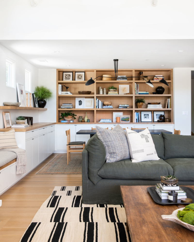
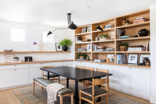
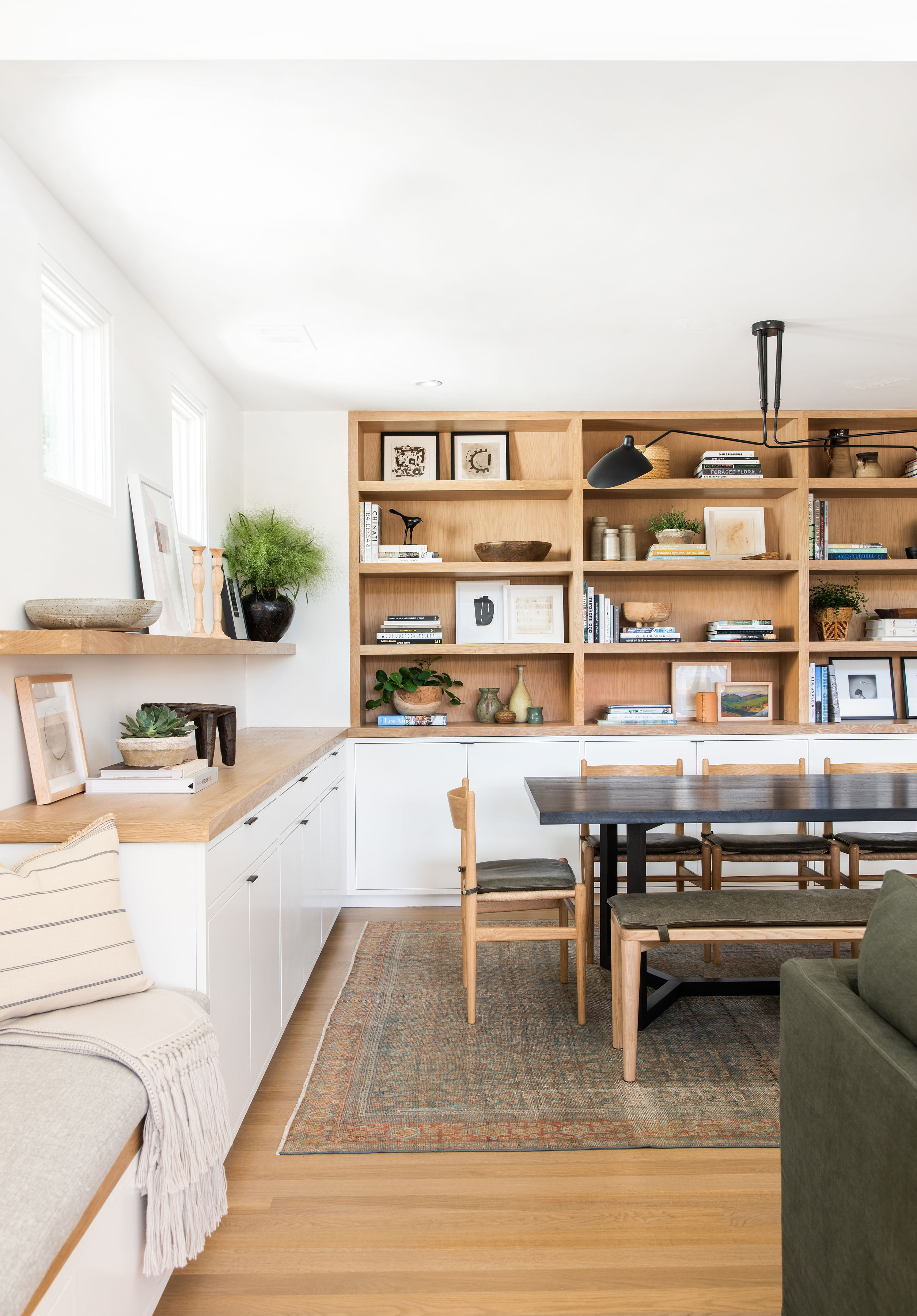
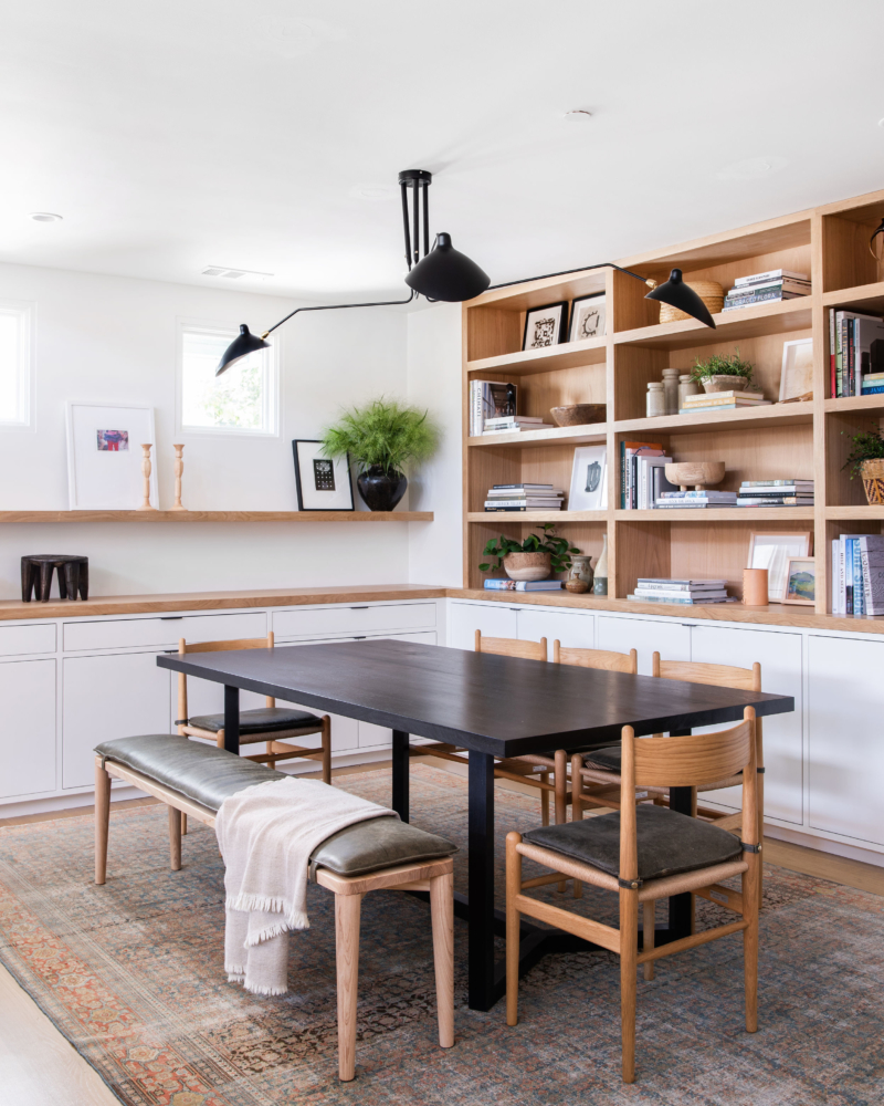
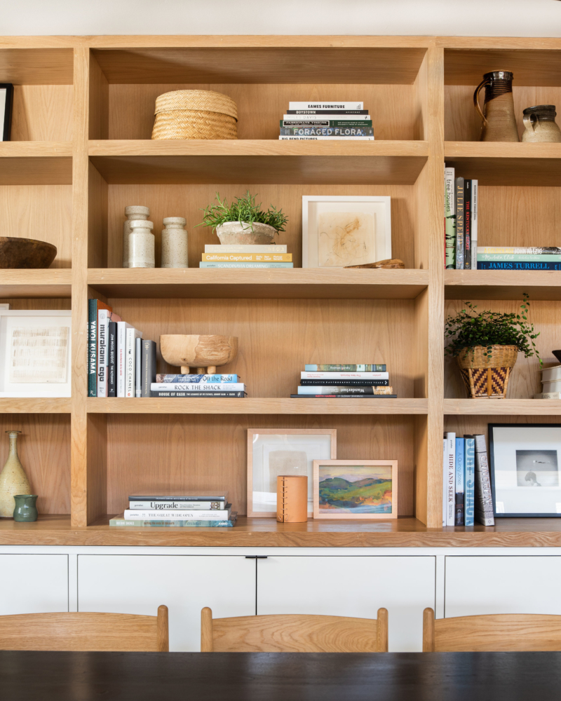
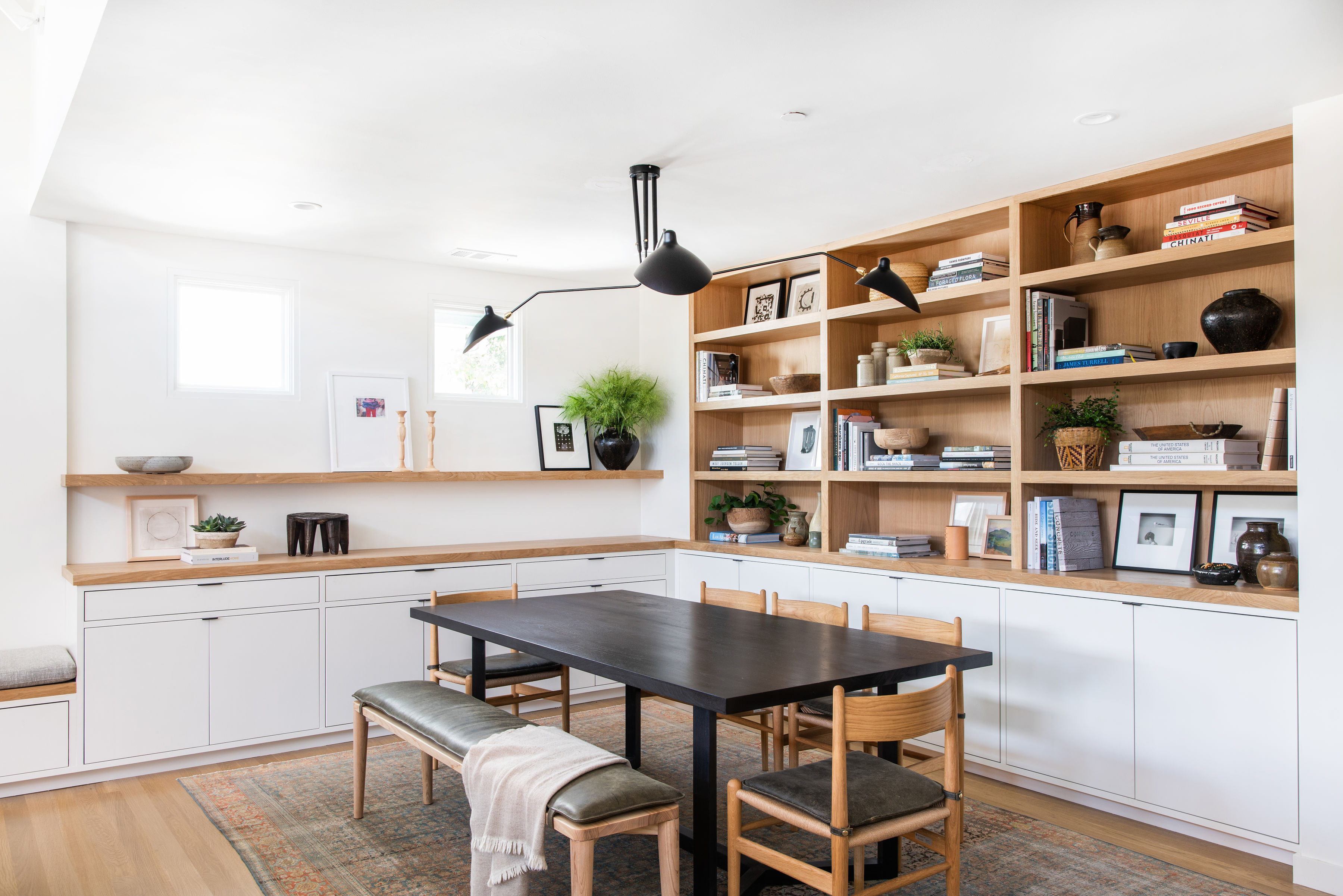
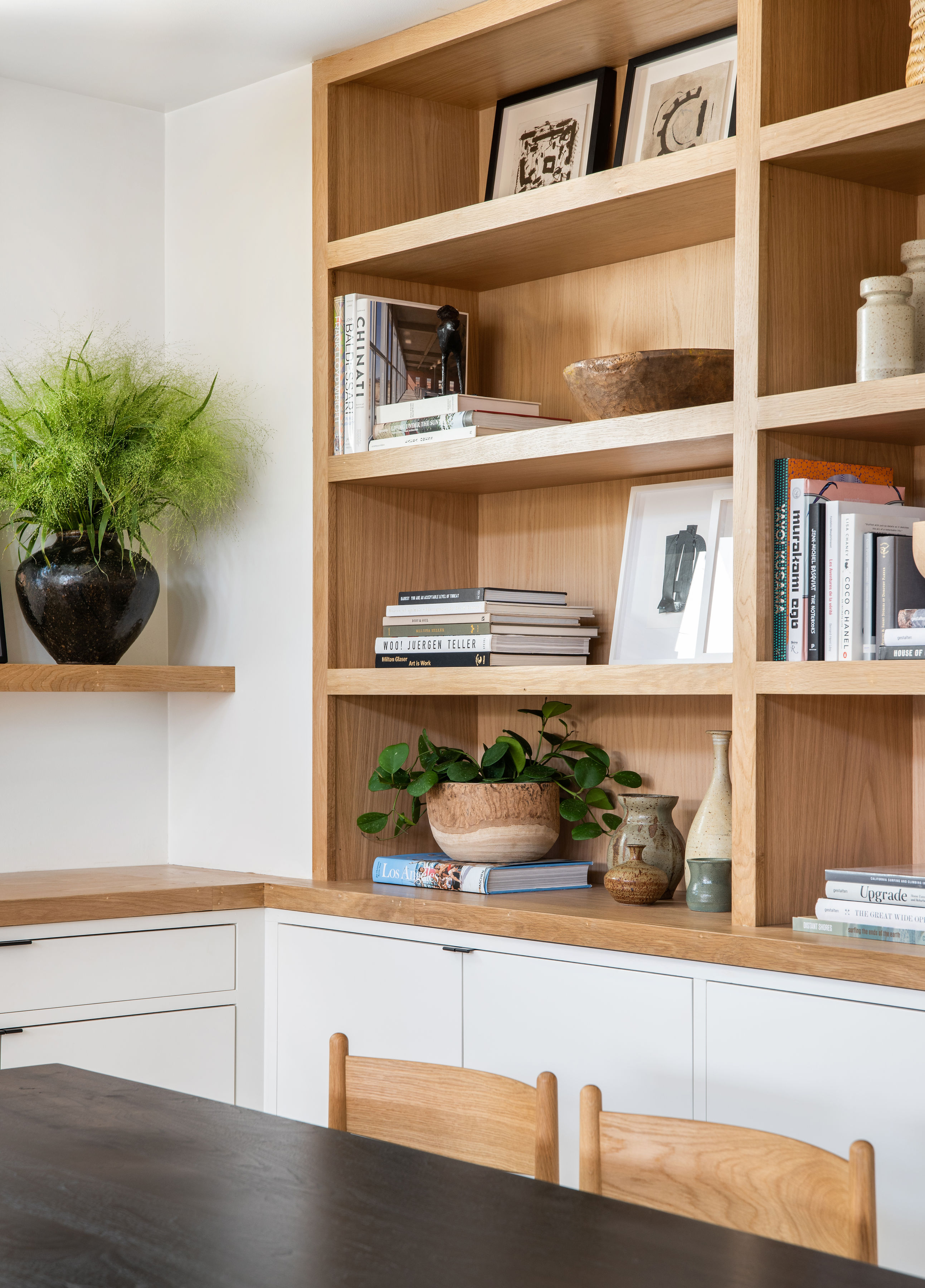
The client and we wanted this room to feel connected to the rest of the home and serve as what I call a ‘catch all room’ — a place where the kids could study, play, eat, you name it. We also knew they needed storage, but wanted to make it feel warm and integrated, rather than just slapping storage on the wall. So, we did a bit of both with open shelving and cabinetry. We used white oak consistently throughout the entire home, with it playing a big role here on the salon shelf and the back of the shelves. And can you tell how excited I was with this massive #shelfie situation? I may or may not have spent hours perfecting this baby — and boy, do I love it! Back to storage… we also wanted a way for the client to store some of the clutter away, so we chose a modern flat panel for the cabinetry and added the detail of the face frame around it to give it an extra custom look. And of course, we included edge pulls to keep them looking modern and low profile.
Shop Living Room and Dining Nook
Kitchen
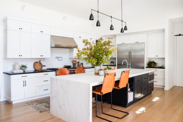
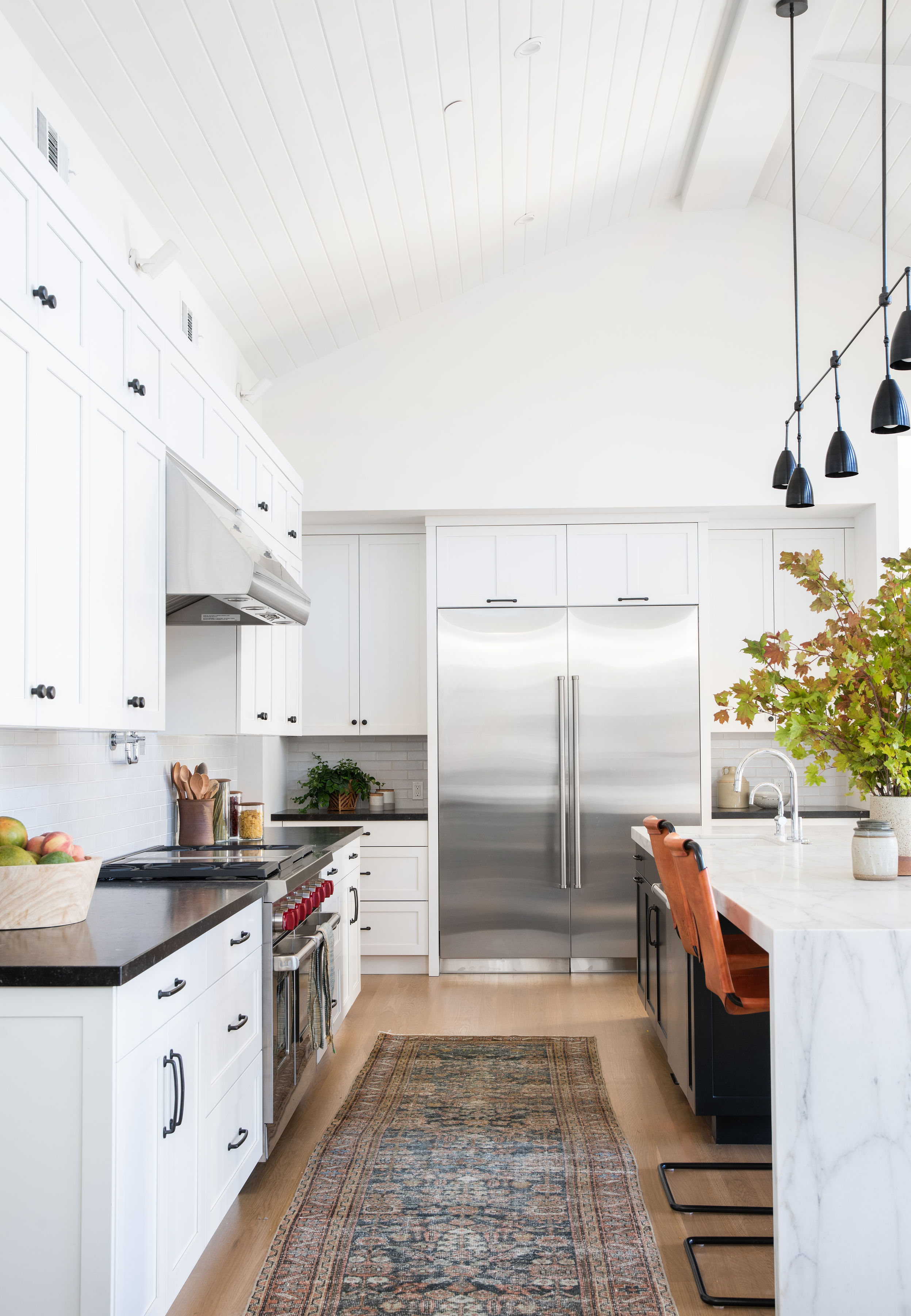
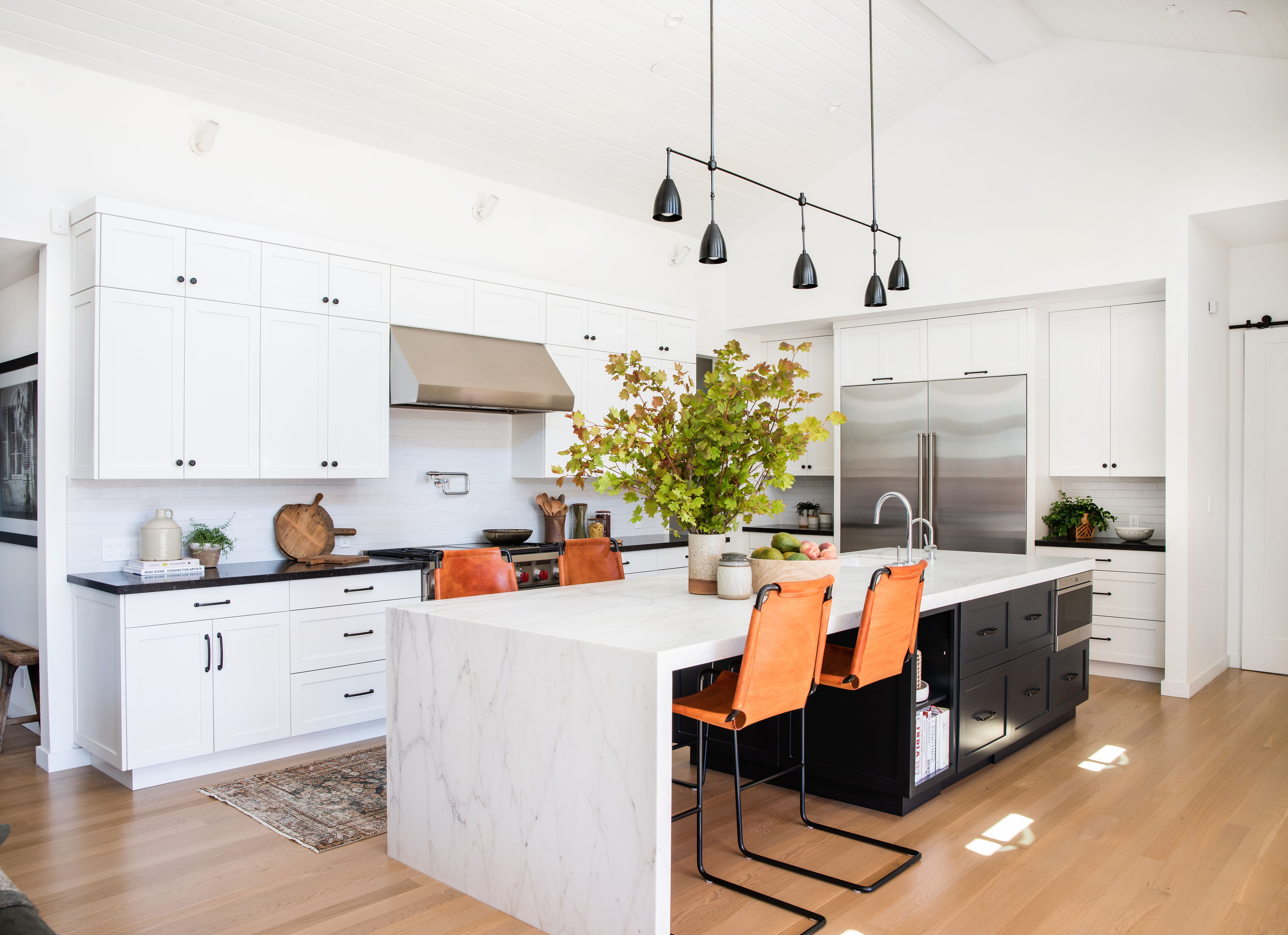
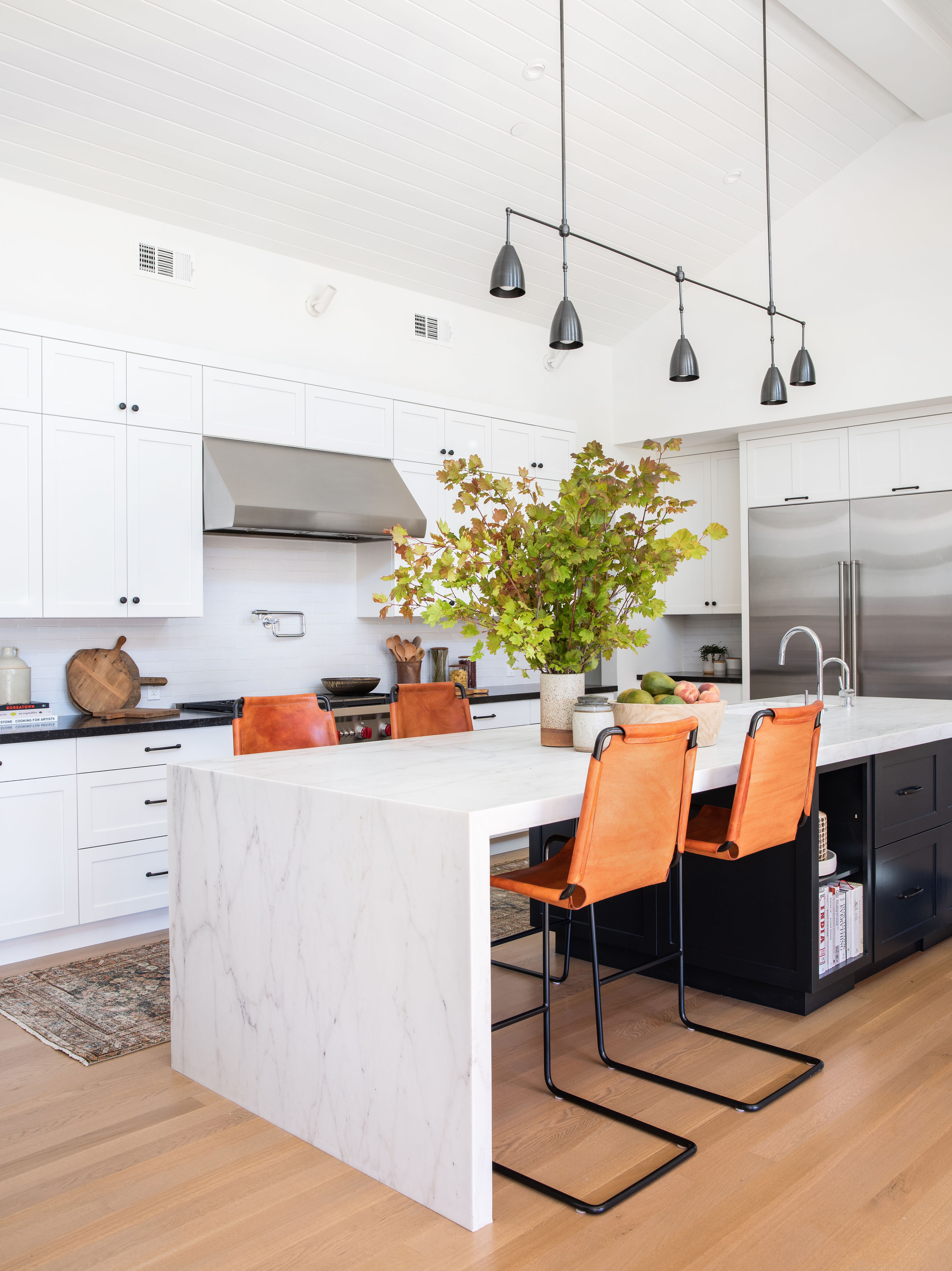
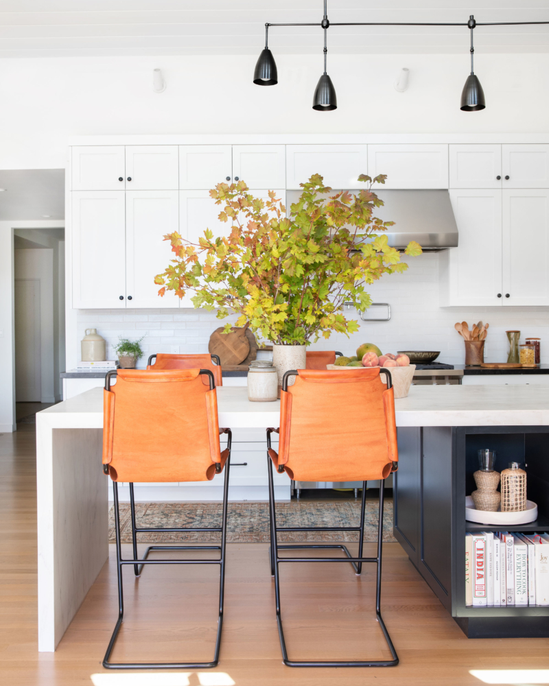
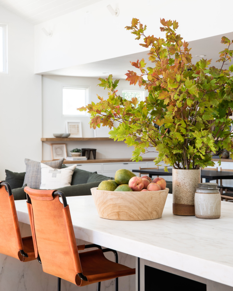
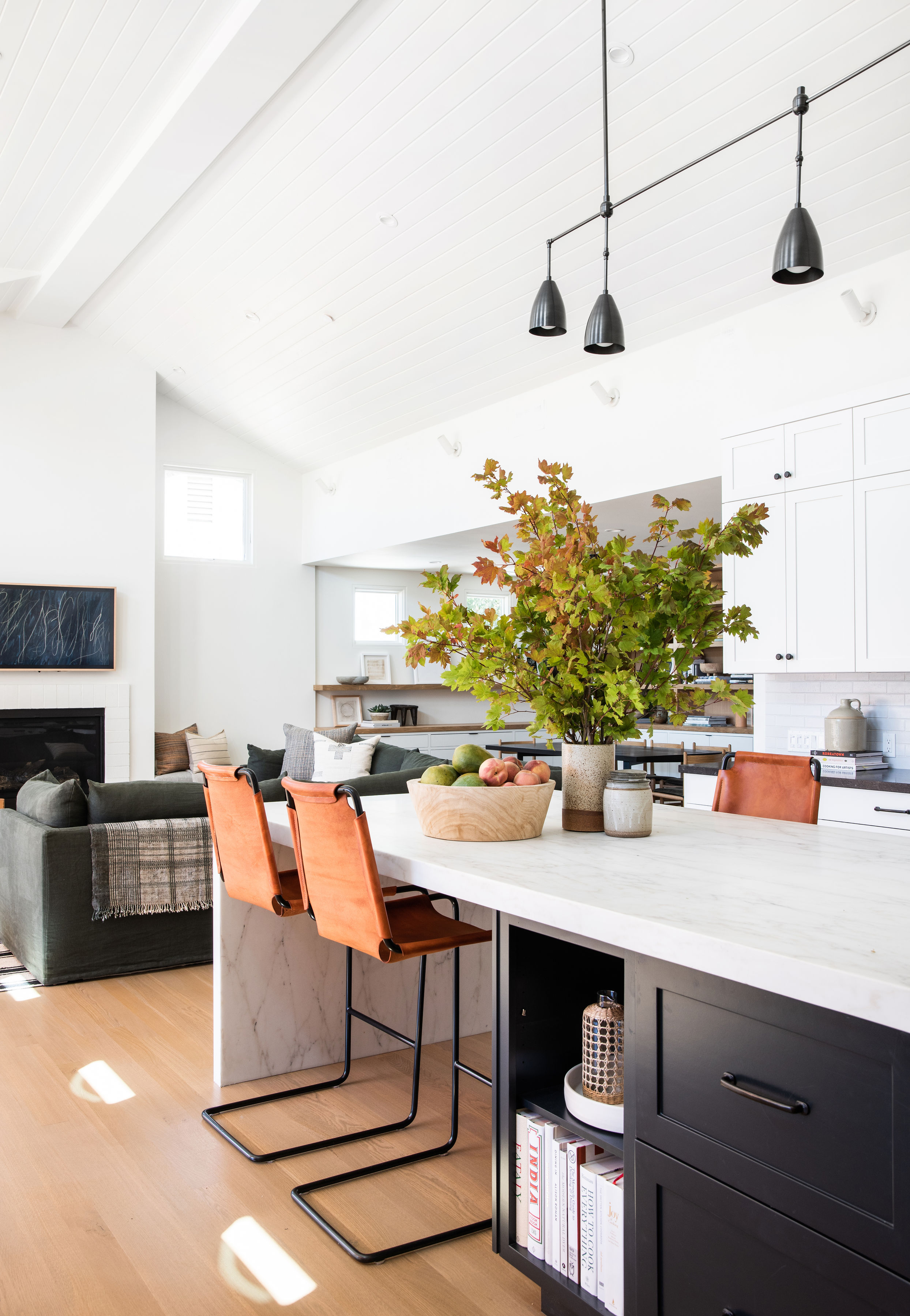
The kitchen was already laid out, the cabinetry was already designed, and the color already chosen, so we came in and finalized all the finish material selections. This included cabinet hardware, plumbing fixtures, and lighting. We decided to go with a darker stone for the perimeter counters to balance out how white the entire open layout room was. We also balanced the brightness of the room with dark paint on the island cabinets and paired it with a white Calcutta waterfall. You’ll notice a lot of black and white elements in this kitchen, but what I wanted to accomplish here is what I call the ‘ping pong effect.’ That basically means, you want your eye to really move around the room, but you want your eye to catch the elements that tie the entire room together. We did our best to achieve that with touches of black here and there. We kept the back splash super simple and focused on ways to add more texture, rather than doing something too out of the box and not right for the house.
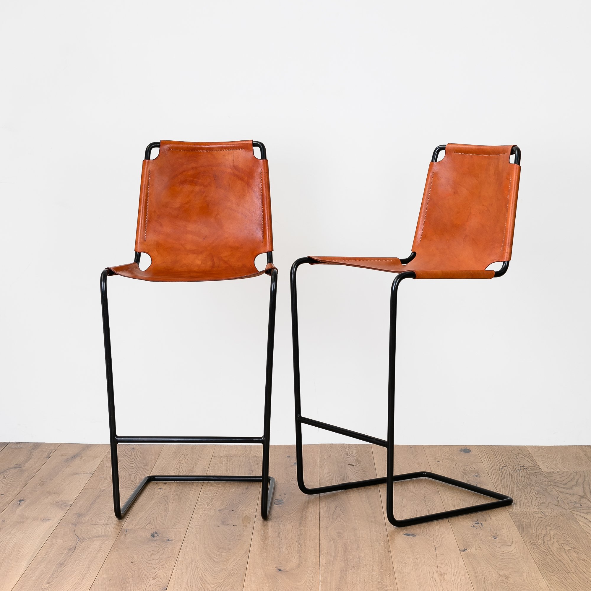
Most importantly, if you’re looking for these stools, GUESS WHAT! You can place a special order directly through Shoppe.
Shop Kitchen
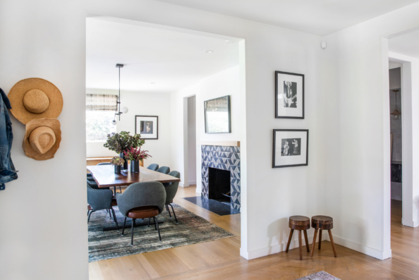
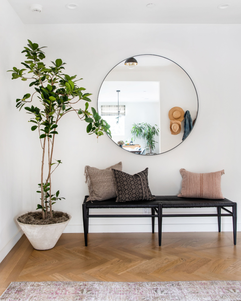
Dining Room and Entryway
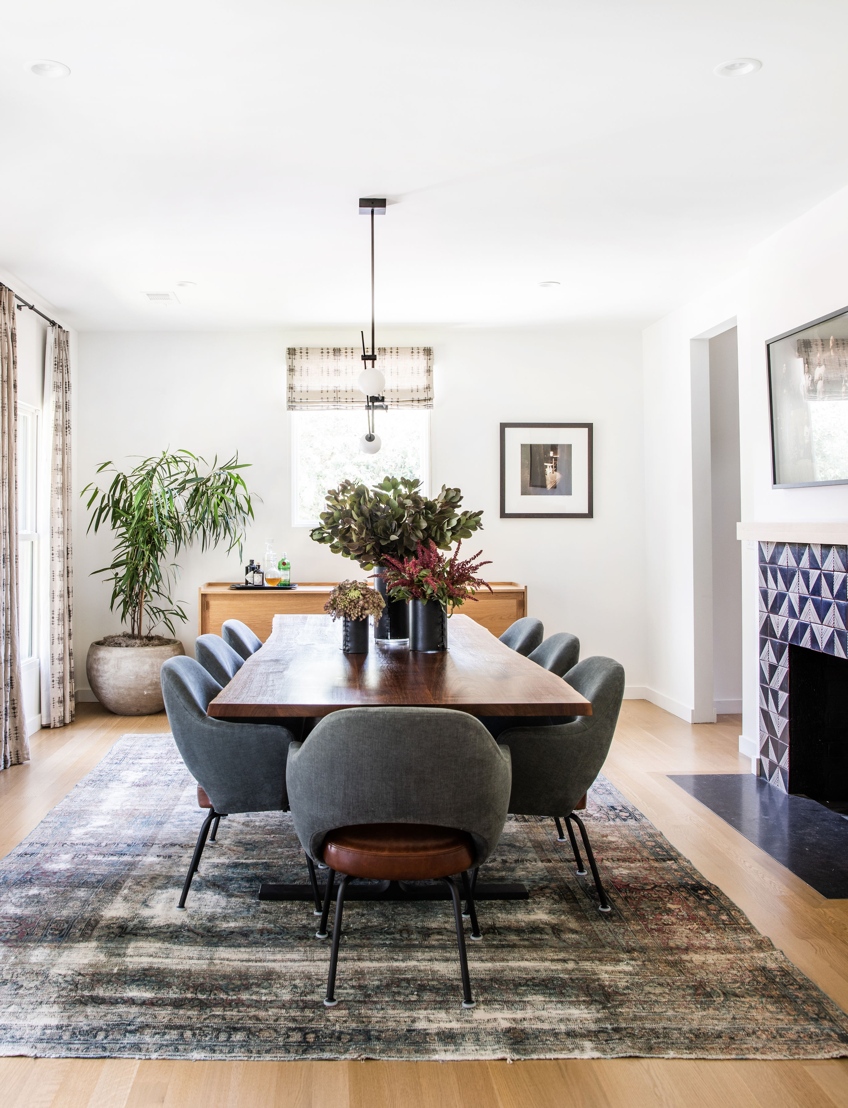
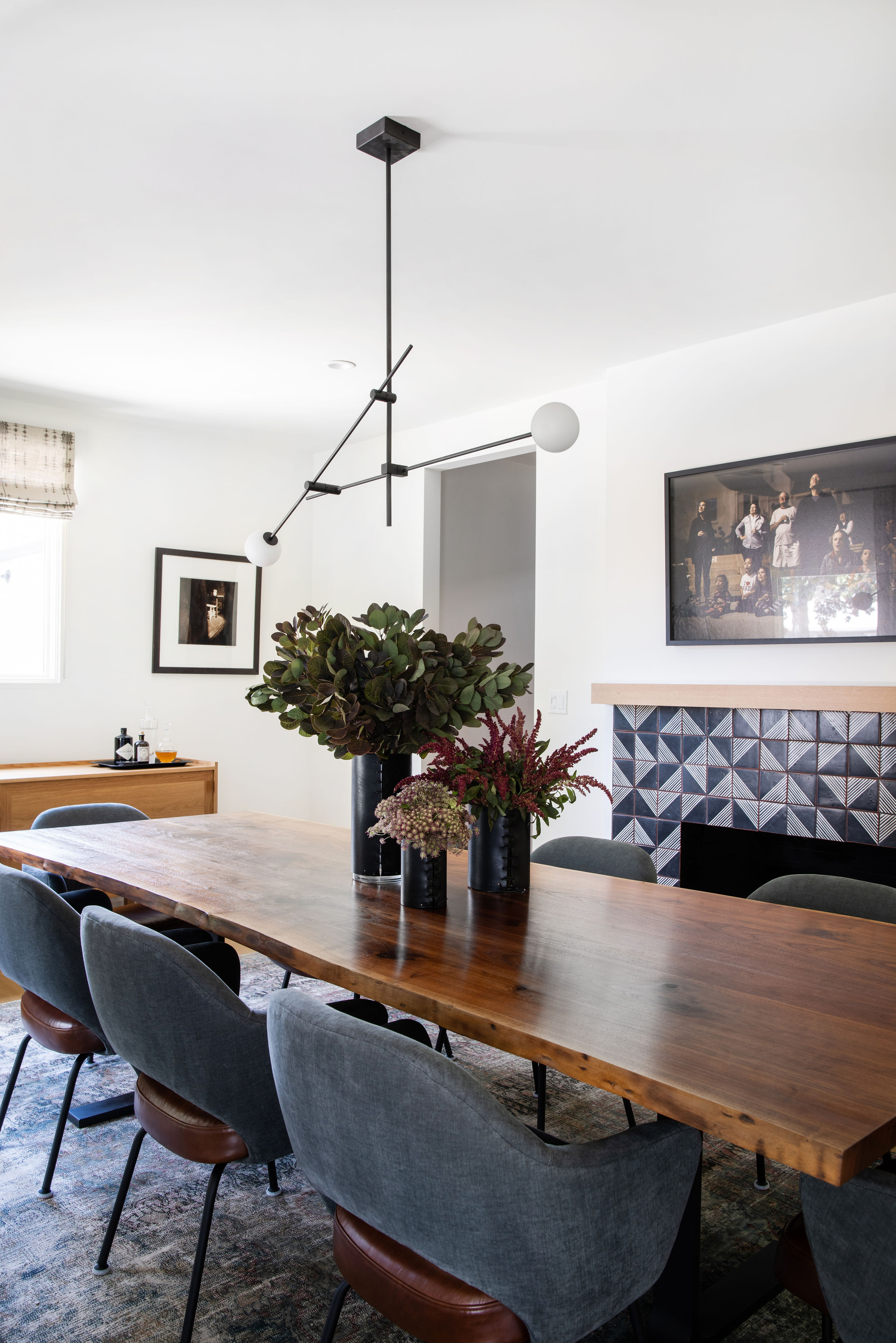
Fun fact! This space in the house was not originally the dining room — it was actually the formal living room (hence the fireplace). Based on the layout of the house, it felt like the natural place. The fireplace was one of the only original things that stayed from the renovation and we gave it a little makeover with some Tabarka tile, which has a handmade terra-cotta feel that I love. We decided on a custom live edge table with simple metal base, that nicely complemented the bases of the chairs, and as a finishing touch for an additional layer, we added patterned curtains around the windows.
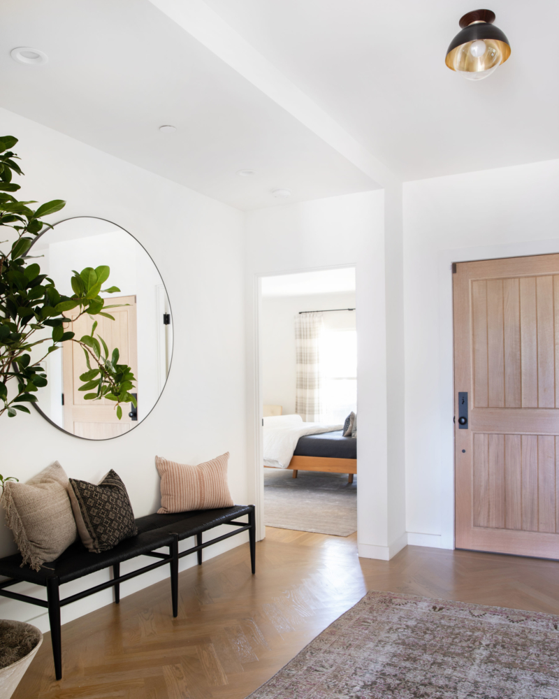
Shop Dining Room & Entry

Master Bedroom and Bath
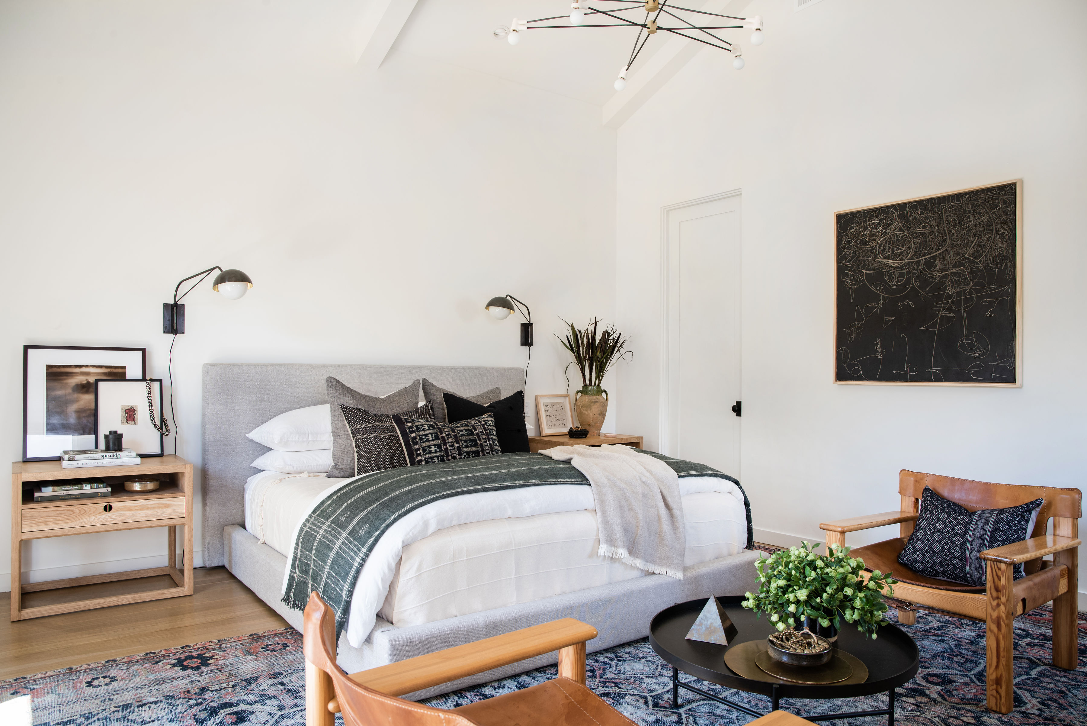
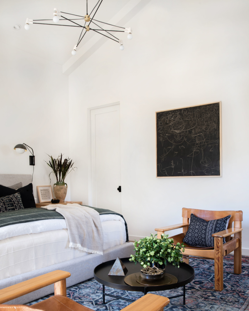
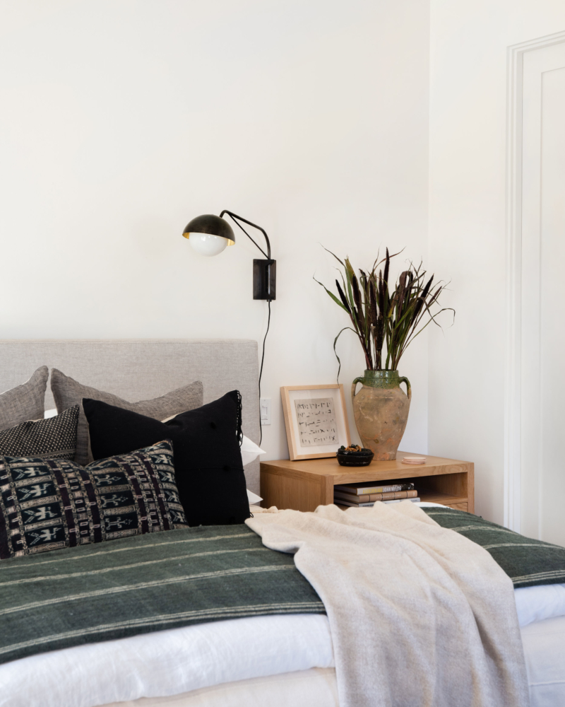
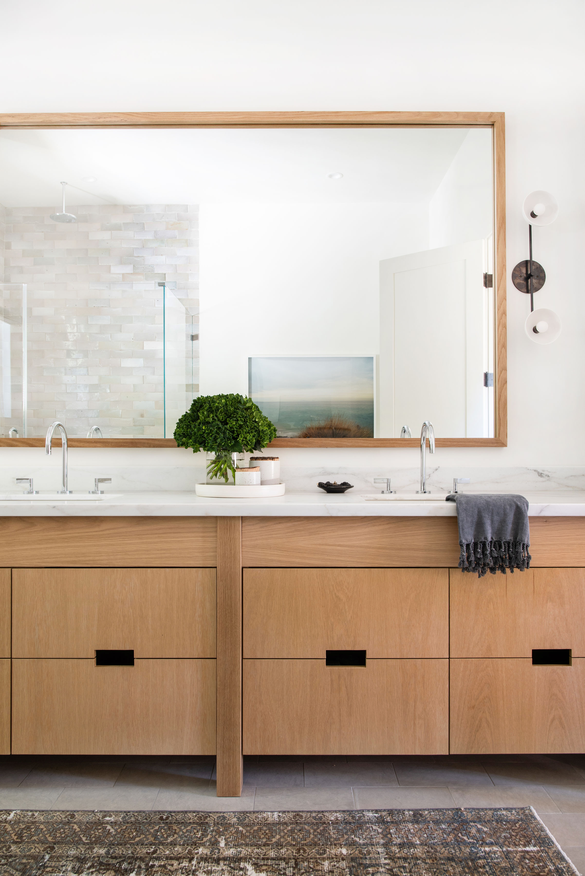
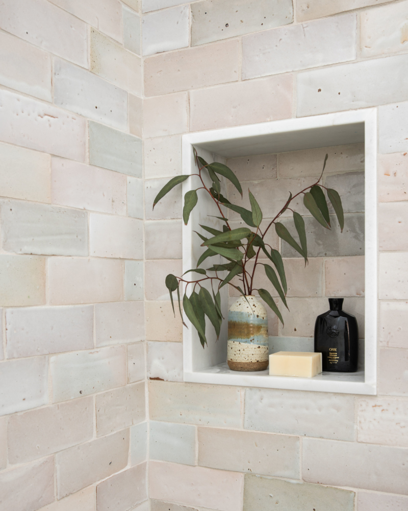
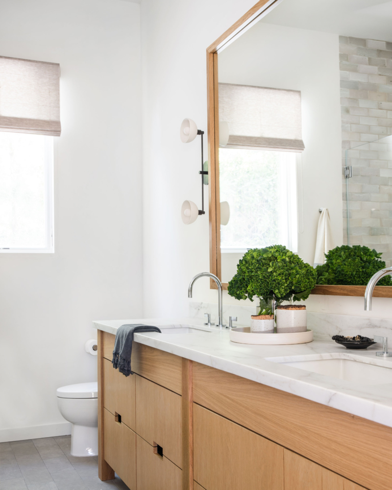
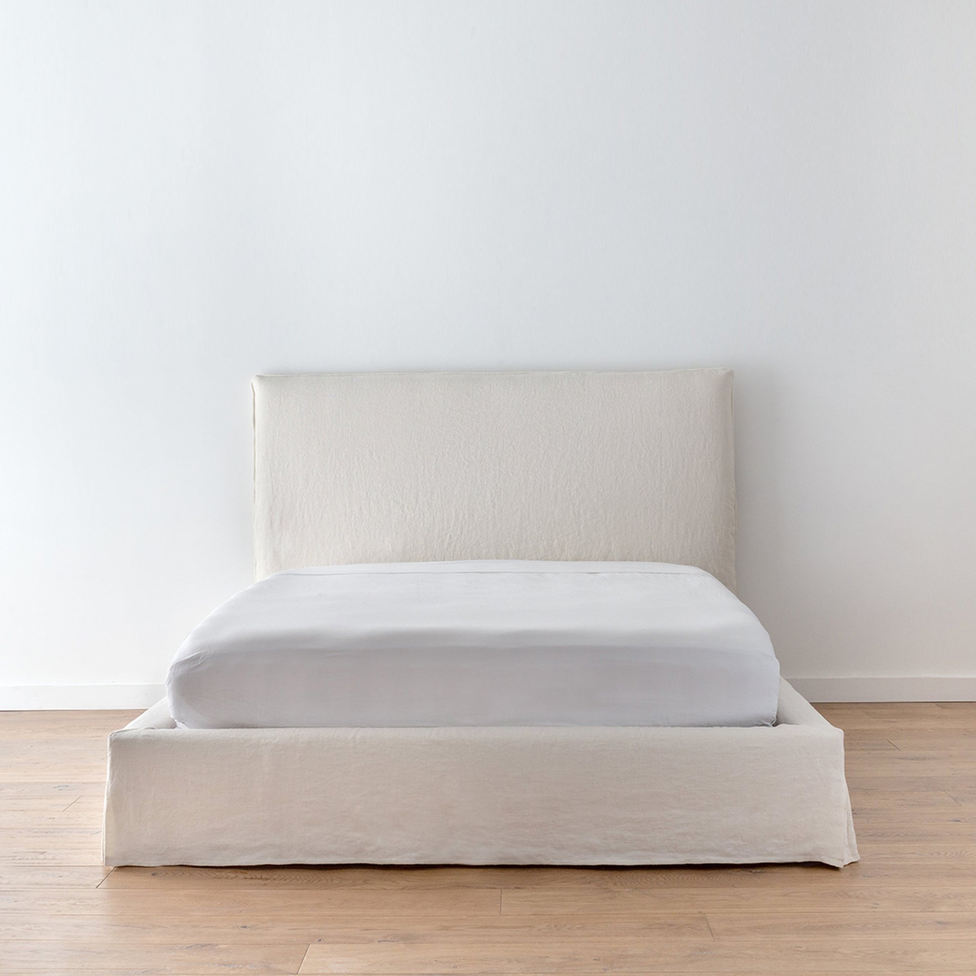
We spend about 50% of our lives in the bedroom, so of course, this space needs to be 100% the comfiest and coziest place in the house. Am I right?! We did that here by keeping the color palette neutral and warm by adding floor to ceiling white oak paneling to the one wall with built-in benches, and grounded the entire room with this gorg rug from Shoppe. As for the master bath, a modern cabinetry style with flat panel and white oak was the name of the game. Voila! 100% comfortable and cozy.
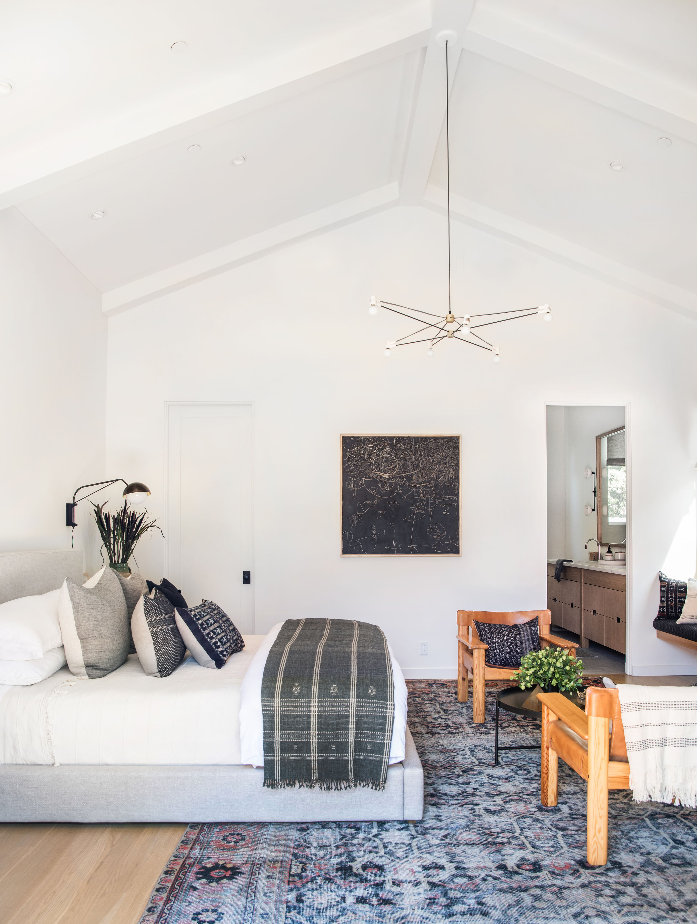
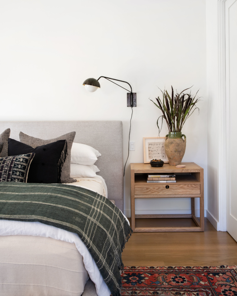
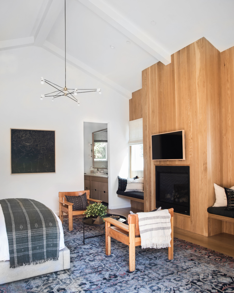
Shop Master Bedroom and Bath
Tween Rooms and Bathrooms
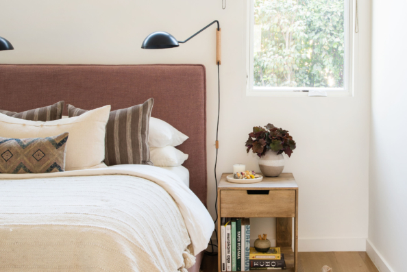
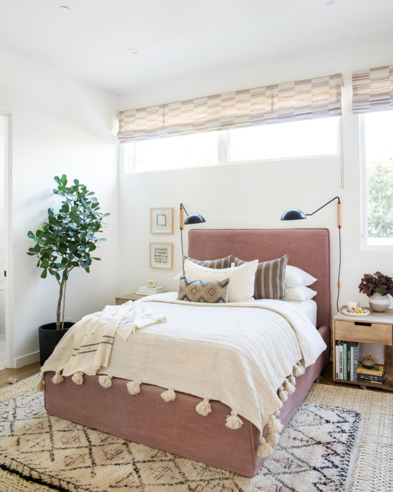
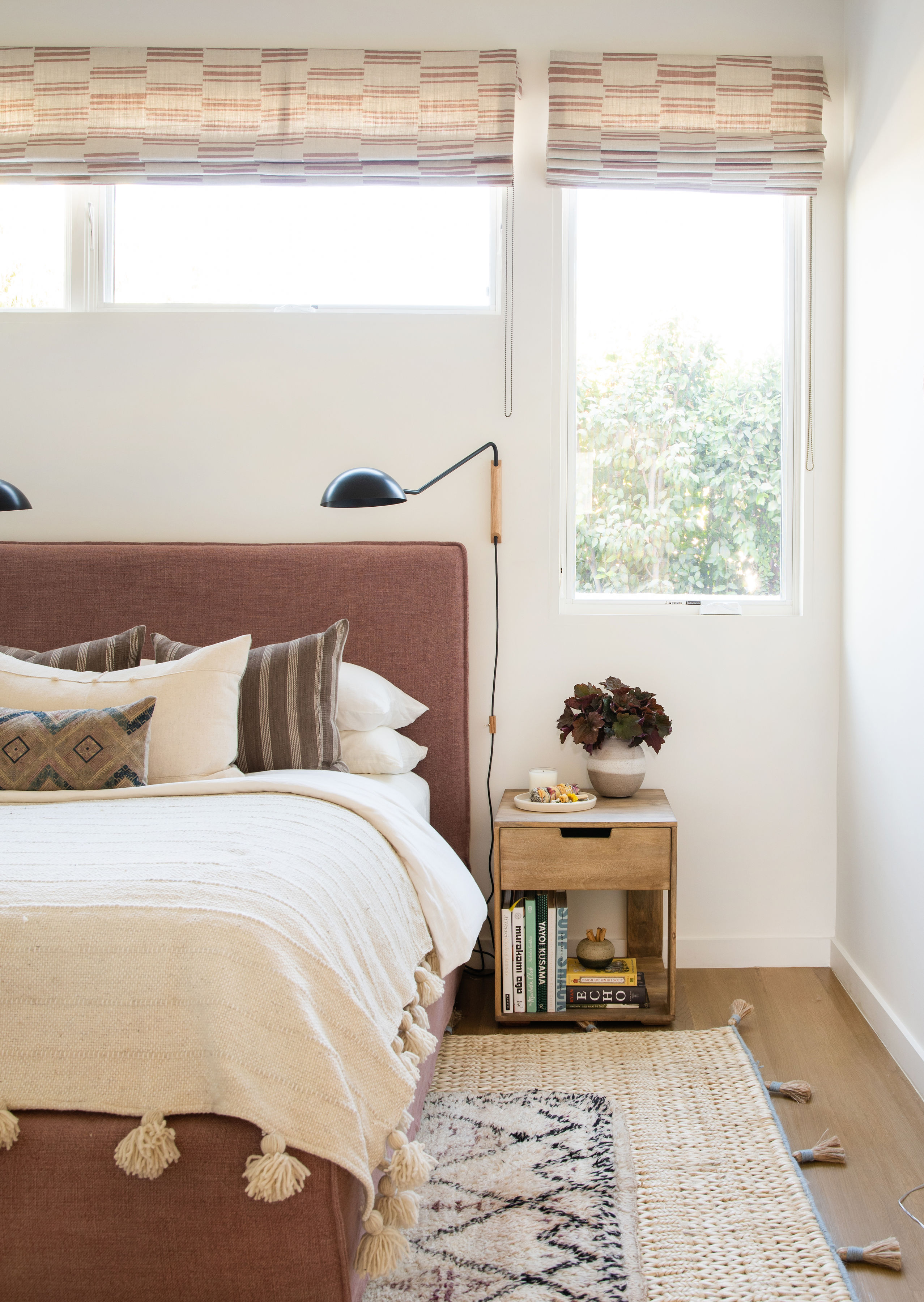
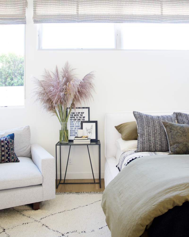
These tweenage rooms are pretty darn cool if I do say so myself!! Each room has a totally different vibe, but both totally California laidback cool. PS! The dusty rose bed is our Buddy Bed from Shoppe in a custom fabric.
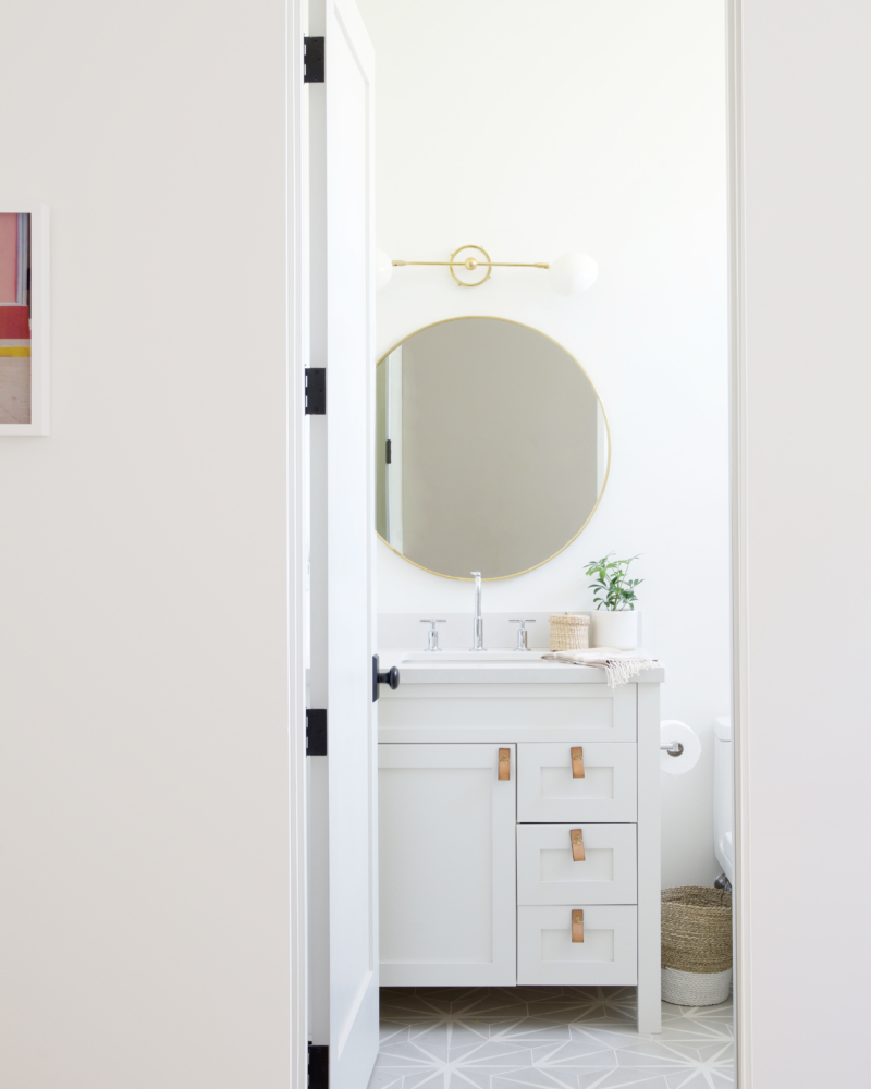
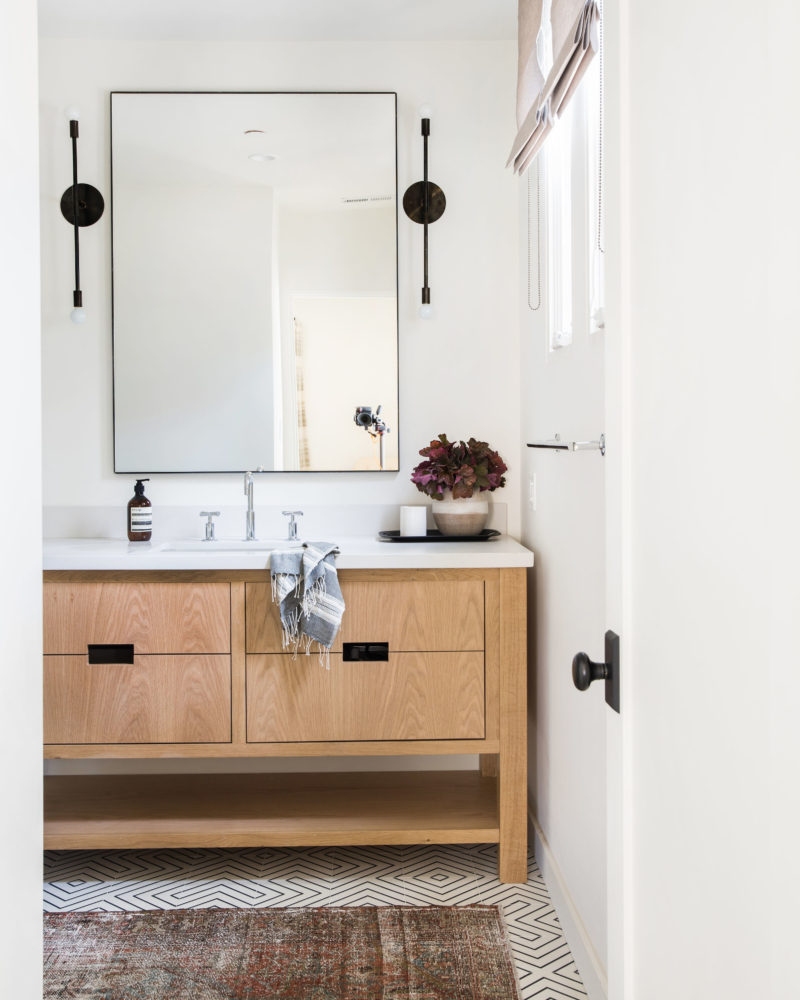
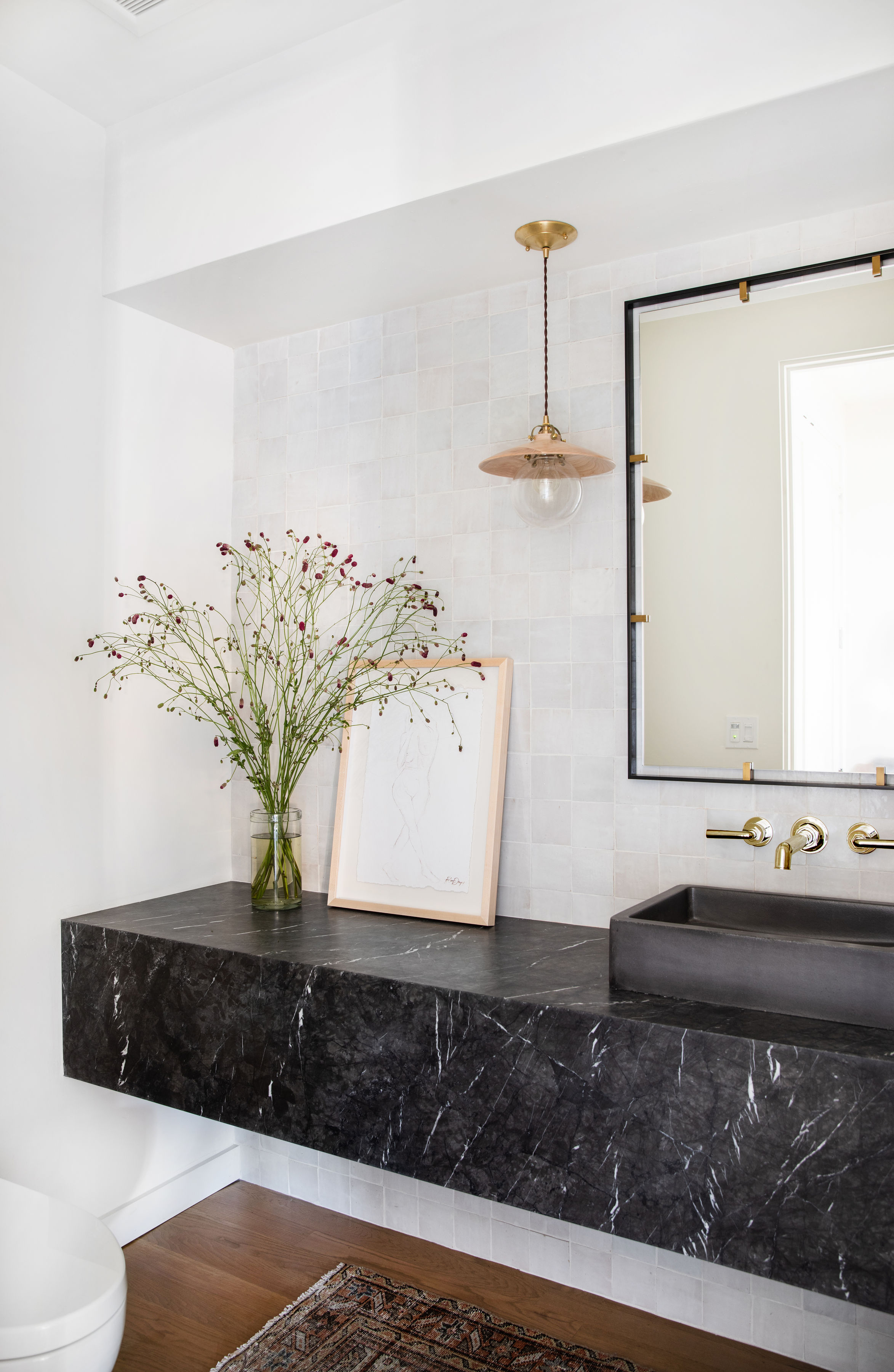
All the powder rooms are a little different, but I am equally obsessed with them all. Specifically, can we talk about the Nero Marquina marble floating vanity, though? It’s currently one of my new fav materials, it’s easier to take care of than white marble and it has depth to it with different colors like browns and grey. The neutral zellige tile was all about adding another layer of subtle texture, as we really wanted the bathroom to be about the floating sink.












Comment